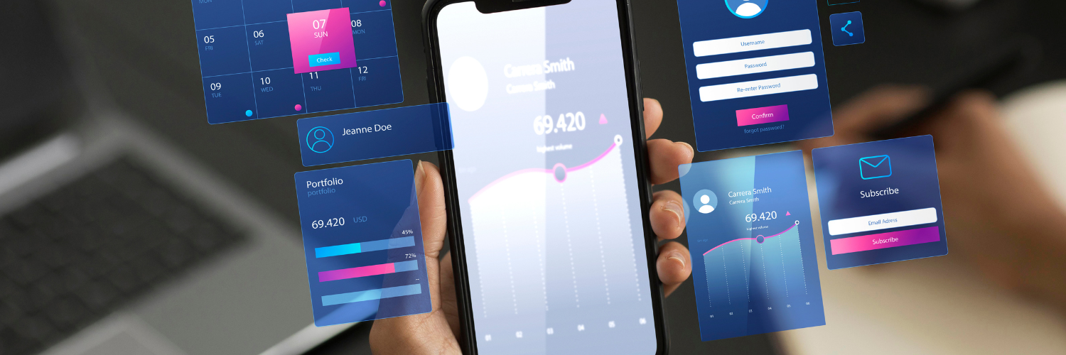
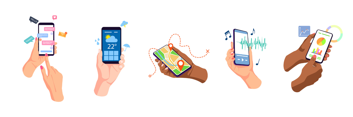
User interface (UI) design is likely the first thing you notice when you start using an application, visit a new website or open software. It is responsible for the visual impression the end-user gets while also contributes to a product’s overall usability.
UI stands for User Interface. It is the point of contact between people and computers. Anything you interact with (screens, sounds, style, and responsiveness) as a user is part of the user interface.
The experience visitors have with your UI sets the stage for their further relationship with your product, your company, and your brand.
UI vs. UX
User Interface (UI) design and user experience (UX) design are often confused and even used interchangeably. But they are actually different.
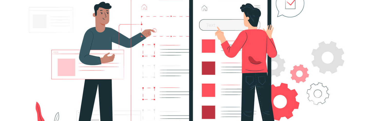
UI design is all about interaction design and the visual elements of an application, while UX design exists to satisfy user intent.
UX designers’ main goal is to help the user get where they want to go. For example, if the user wants to find company’s contact information, the UX designer ensures that the navigation is clear and such information is easily accessible. The UI designer will work on how an interface looks and behaves.
A user interface has the following 4 components:
- Navigational elements (slide bars, search fields, and back arrows).
- Input controls (buttons, checkboxes, and text fields).
- Informational components to communicate information to the user (a progress bar beneath a video, for example).
- Containers to organize content into easily digestible sections (like an accordion menu icon to hide or show content).
And can be of 3 different types:

- Graphical User Interface (GUI) - A graphical user interface allows users to interact with a device through graphical icons with the use of a mouse, trackpad, etc. Your laptop’s desktop or home screen make perfect examples of a GUI.
- Voice User Interface (VUI) - VUI uses speech recognition to understand various voice commands. Some examples of VUI include Apple’s Siri, Google’s “hey google” feature, and Amazon’s Alexa.
- Menu-driven interface - Menu-driven interfaces show command options via a list or a menu. ATMs and digital parking meters are the most common examples.

User interfaces should guide the users through content and task flows seamlessly and effortlessly. An excellent user interface eliminates unnecessary components, while also has a strong focus on crucial tasks.
Furthermore, a well-structured UI helps in the following areas:
- Improves general SEO performance
- Increases the time spent on site by user
- Reduces the bounce rate
- Reduces user frustration
In order to get the most out of their UI, business owners should pay attention to the latest trends as well as the most efficient practices. In this article, we will present 5 of such.
The best UI design practices
1. User research
A good user research helps you better understand who you are designing for.
While taking any decisions, designers should consider the type of the end-user, their needs, goals, and the reasons why they use a website or app.
A common mistake is to design for yourself and choose what looks best for you. However, keep in mind that what seems logical and intuitive to you might confuse your target audience. That's why it is crucial to understand your users.
How can it be achieved?
Well, the basic data gathered from user research via questioners, statistics research, and card sorting, for example, eliminates the guesswork and provides you with the necessary answers. In general, research is a great starting point that makes everything easier down the line.
“32% learn about application performance issues from end users.” (ManageEngine)
Why not to learn from them how to better organize an app from the beginning?
2. Being purposeful while creating a page layout

One of the fundamental rules of good UI design is to structure your pages based on importance. Here are some pieces of advice on how to achieve it:
- Pay attention to the special relationships between separate elements;
- Order your UI elements strategically. First, draw users’ attention to the most important information on the page and make it readable;
- Apply a clear hierarchy system to your design through placement, colors, and typography;
- Design each item in accordance with its function;
- Stay away from clutter, keep the visual elements simple;
- Use the headings, group similar elements together, add points and numbers;
- Strategically use different font sizes styles to enhance readability, scanability, legibility.
3. Provide feedback and response to your user
Users should feel fully in control—whether they really are in control or not - while going through the details about your product or service. For example, if your customer is ordering food, let them know they need to complete the last step or that their food is already on the way. Give informative feedback on each of the user’s actions and let them backtrack without losing much time whenever they made a mistake – a good UI should be forgiving.
4. Avoid unnecessary complexity
Always aim for the minimum number of steps and screens possible. Use overlays to condense data and reduce your website’s or app’s footprint (for example, bottom sheets and modal windows).
But be sure to organize information in the way it is logical, short, and self-contained. In fact, one of the golden rules of a good UI design is to group tasks and subtasks together. Not only by topic, but also in a manner it is highly practical.
Another tip here is to not hide subtasks on other pages where they might be hardly reachable. Nobody expects to find the toothbrush in the kitchen or pans in the yard.
Also, try to avoid sending users through a tedious obstacle course of clicks when just one or two actions can be enough.
Tip: Facebook and WhatsApp make some good UI design examples. Their interfaces require a very limited number of user gestures.
5. Determine the main message
Choose the elements of your design with a purpose in mind. All the elements and the layout you select should all be intentional and not just look good.
Design is actually more about how something works than how it looks. It’s about both form and function.
Here are some more tips for designing with intent:
- Choose a font that shows personality and allows the user to more easily read your content;
- Choose some intuitive visual elements that help users accomplish their tasks faster;
- Always improve site navigation.
- Meet your users’ expectations
For example, give commonly used names to the headers on the navigation menu. This will reduce any potential frustration readers may have while navigating and becoming familiar with a new platform.
Sometimes, you may need to question why you want things done in a certain way. By doing this, you can uncover those rationale behind complex design decisions.
Conclusions
UI design needs to be agile according to end-users’ needs, as much as your team needs to be agile according to product requirements.
User Interfaces are the access points where users interact with designs. In this article, we aimed at explaining the concept behind User Interface design, its difference from User Experience design, while our top 5 design advice and principles strived to answer the question: what is a good interface?
Designing user interfaces requires extensive knowledge and user psychology. While by also adding the best practices in the field ensures the top performance of your UIs.
For free consultation about UI design click here.
----------------------------------------------------------------------------------------------
View the full presentation:
WRITTEN BY
Sofia Kutko
2022-09-26


