If you doubt that even a great UI design will be good enough for many years, then most likely you are right. In this article, we will go deeper into UI design elements, explain why it is important to upgrade them regularly, when and how often to do so, and more.
What is user interface (UI) design?
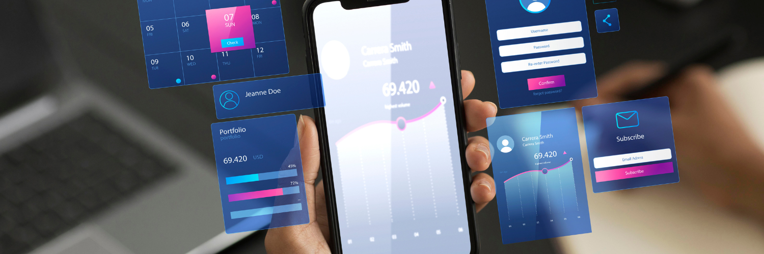
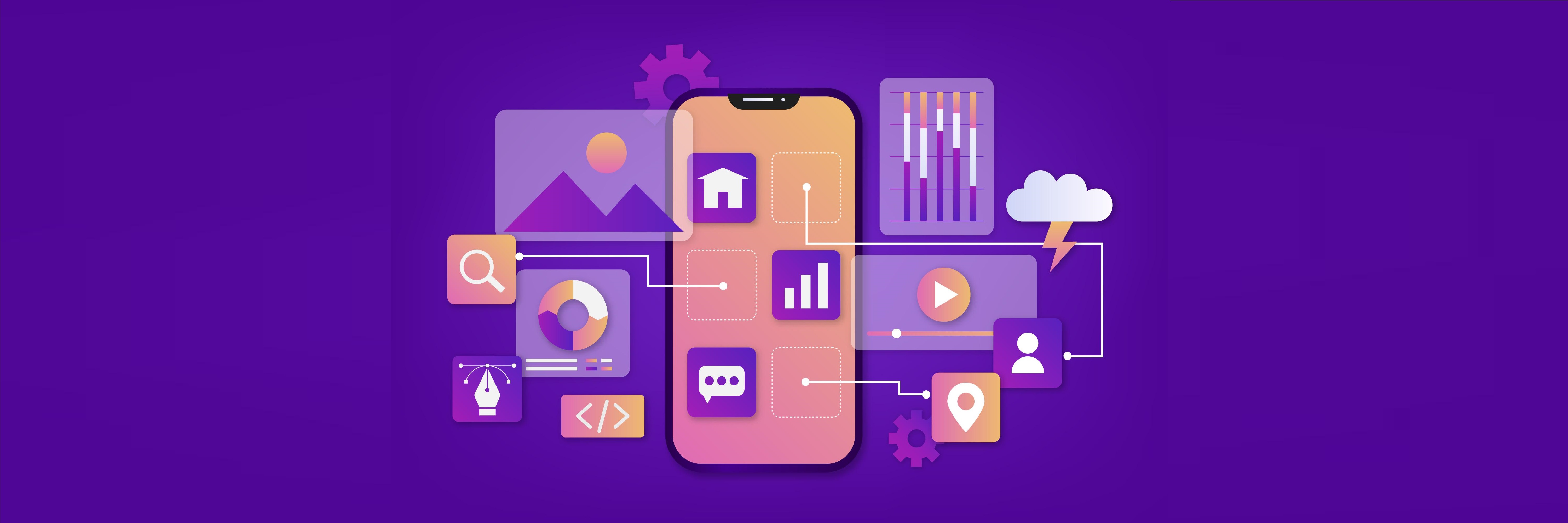
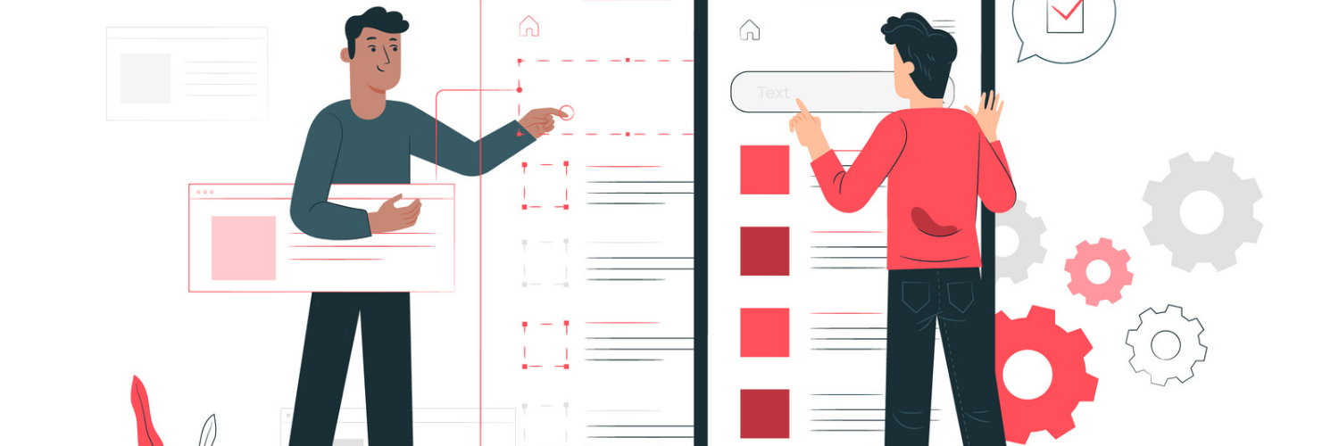
User interface (UI) design is the process designers use to build interfaces in software or computerized devices, with a focus on looks or style. They aim to create interfaces that are easy to use and look at.
UI focuses primarily on the aesthetic part of a website or app. However, it’s more than just good-looking buttons and stylish design elements—UI is the face of your product and can define the overall UX.
As with anything, UI design trends can change frequently, and often it is even hard to keep up. Since your UI design is what your users interact with, they might not stay long if it’s not up-to-date enough.
What is a UI update?
UI updates allow designers and app developers to revitalize user interactions with their app or site, address any discovered issues, and add new design elements to enhance their platform. With the ever-changing landscape of UI and UX design, it’s important to stand out and introduce innovative design solutions.
5 Reasons to always keep your UI up to date
1. “Always Dress For Success“
Too much minimalistic or poorly designed app navigation can significantly increase your bounce rate.
2. Great Design - Great Business.
The goal is to make a “wow” impression on your users when they first interact with your website or app. It automatically creates an early “wow” for your products and services.
3. Users do pay attention to your content
Useful and up-to-date content is your best marketing tool. Global trends are changing, and so should the content you provide your online visitors with.
4. Following the latest trends in user-friendliness
Users like intuitive designs and search. For example, clear and consistent navigation is a basic requirement for the user interface.
5. The quality of interaction is the foundation
Most experts agree that the convenience and simplicity of the user interface = quality customer service.
When is the time?

There are several key signs that your UI design needs an update:
- The design looks outdated
Most site visitors will initially rate the credibility of your business based solely on your design and content, while web design trends change every few years. On average, a site should be updated at least once in 3 years.
- Decreased conversions
Have you noticed lately that the site is selling less? Maybe the traffic is the same, but there are fewer sales.
Falling conversions indicate that fewer visitors are interested in your offer. This may also be caused by the activity of competitors, but we recommend soberly assessing the internal factors.
If seasonality has nothing to do with it (you can easily check it using analytics data) and your conversion rates are decreasing, maybe it's time to revise the content on the site.
- Your competitors are doing better
Let’s accept that we always compete. So, we will be constantly compared.
It is important not only to highlight the competitive advantages of your offer but also to make sure that you are noticed and remembered.
Here are the signs it is time to learn from your competitors:
- you notice that visually you like your competitor’s design much more than yours;
- find good ideas on their website that would be nice to implement on yours;
- you stay on their website for more than 20-30 studying the content;
- show their work as an example for your employees;
- want to buy goods or services from them.
Start right away from the UI.
- Longer loading time
The older your product is, the more likely it is that your mobile version lacks a responsive layout. Or it takes much more time to load when compared to some most famous sites. Remember that the share of mobile traffic in recent years significantly exceeds the volume of visits from computers in most cases. Make sure your app works smoothly from any tablet and mobile device, with an appropriate UI.
- You feel your navigation is not efficient
There is a rule: any action should be made in 3 clicks.
And since more and more websites follow it, the user is getting used to such ease and is less appealed to by “confusing” websites.
If it happens that you feel like your navigation could do better, you are most probably right. Go for little changes.
What drives the right change in UI design?
There are three main drives you should always consider:
1. User needs
User needs are changing daily, and your UI design should evolve fast enough to cover most of them.
2. Technology
In the world of rapidly changing technologies, people are forming new expectations of how the UI, which they consider good, should work. Therefore, it is important not only to live up to their expectations but to exceed them.
3. Tastes
The purpose of having a UI is to connect with users and deliver value to them. Therefore, trends and design choices should be made accordingly.
How often to update UI?
The industry standard is to update it every 3-5 years, so don’t put off changes when you know it’s time to make them.
If it’s been a while since you introduced changes to your UI, or if you’ve tried a couple of improvements but nothing has worked, it might be time to talk to experienced UI design professionals.
Contact the best app developers in Utah to maximize your competitive advantage and develop a winning UI for this year. Click here.
For free consultation about UI designers in Utah click here.
----------------------------------------------------------------------------------------------
View the full presentation:
WRITTEN BY
Sofia Kutko
2023-02-06


